Frequently Asked Questions (ReNext 1.4.2)
Q: Why did you build ReNext?
A: In the last 2 years, I have written 3 books. I used Ulysses to complete it on my iPhone, which made a lot of software unable to help me realize the function of memory. My head always contains all the complete frameworks, levels, and details of a book, because I need to immediately locate where I need to change and add. So I need to know what kind of book I want to write, what I want to write next, and what I have written. We often rarely encounter such huge memory projects in our lives, and ReNext, which is capable of similar complex work, can achieve goal management more easily.
Q: What's the design of RENEXT?
A: The philosophy of design of ReNext is love and nature. The design concepts of ReNext are Balance, Humanity, Optimal visual effect ratio, Global Unification, Elegant, extreme, and high efficiency. The design style of ReNext is minimalist. The main design elements of ReNext are color, font, and space.
Love: To make the user experience better for people with different hand sizes, both children and adults, we broke the existing top-down visual framework.
Nature is simplest: elaborately use the color and space of natural elements as nature, no more need for visual aid for the frame or line, but the joy of exploring. You learn about the natural world by constantly touching, tapping and observing it, a process that gives you a better understanding of its fascination and the joy of growing and reaping the rewards. So we give you the choice, and some more thoughtful hidden features are waiting for you to explore.
Balanced: traditional and modern, user inertia and progress, visual inertia and fresh air, functional inertia and science, even different design concepts. Because a habit is the most accessible and efficient way to effectively reduce the cost of learning, and the innovations made on this basis are also the most likely to have an overlapping effect.
Humanity: humans make tools to meet human instincts and needs, not to endure their defects, otherwise they are anti-human. The long full-screen smartphone is out of the control of your thumb. It’s definitely anti-human. So, we are trying to keep interacting in the area of your thumb. So we add a bottom interactive zone and some more hidden thoughtful gestures.
Optimal visual effect ratio: providing better visual design under the premise of realizing the same product functions. The healthy competition between design and function sacrifices neither product function nor industrial design. This is what we insist about an optimal visual effect ratio. The bottom-up UI framework faces a lot of compatibility issues. Functionality that could be achieved with very simple code in the normal top-down UI framework, we had to look for new solutions to implement. For example, the first keyboard popup doesn’t appear in the right place, and to-do groups don’t show up in their entirety, and data-saving crashes. Whenever there was a slight problem, we basically had to find a completely new solution.
Global Unified: we are trying to make sure that each element and each design element follow the same design concept. Insist on a coherent user experience. Because we introduced a brand-new gesture system, which led to the confusion of gesture logic in some interfaces. In order to ensure the most core gestures, we gave up some gestures to ensure a consistent user experience. For example, in order to unify the gesture of sliding down to return, we completely discarded the gesture of swiping to the right to return.
We are pursuing the maximum amount of visual information in the minimum visual unit, and the perfect spatial combination of all visual amounts of information. We integrated the adding and editing of to-do groups into one page, which not only greatly reduces clutter and improves management efficiency, but also improves visual information density.
We are trying to do our best to pursue the perfection of every detail. The background image, for example, is an original made based on the only wallpaper I've seen in a decade that as I've seen it more and more and to love it more and more.
We are insisting simple, clear and natural. No chaos, no interference, no detour. The memory resources of the human brain are limited, reducing non-intuitive memory, thinking levels, interactive steps, and increasing intuitive associations.
I even want to share more about ReNext with you, but I have to control myself.
Q: Do you have a plan for a widget?
A: No widget forever. The widget is an ugly and inefficient industrial design element on the iPhone. I have explained in my book and published on Medium.
Q: Do you have a plan for dark mode?
A: No dark mode forever. I have explained in my book.
Humanity:
Humans make tools to meet human instincts and needs, not to endure their defects, otherwise they are anti-human. For example, people are used to living in a colorful world in the sunlight, so please don't tell me how much power-efficiency the dark mode of the OLED screen is, not to mention how anti-human the experience of exploring the unknown world in the dark mode is. Moreover, when displaying pictures with a pure white background, the OLED screen is not more power-efficient than the LCD screen. The problem of power consumption in OLED screen daylight mode is that technology should cater to human nature for improvement, not an excuse for smartphone manufacturers to change users' natural lifestyle through misleading marketing. In this way, innovative solutions to solve problems disappear. The source of human nature comes from the instincts in human/biological genes: survival, reproduction, and passing-time. From this, more specific instinctive needs are derived, such as eating to ensure survival, sexual behavior to promote reproduction, and chatting and playing games to passing-time. Further to the next layer, eating, decomposition, digestion and transformation ensure a perfect energy supply system; foreplay, posture and battlefield promote high-quality sexual behavior; morality, etiquette, rules, etc. promote more efficient passing-time. In the process of human evolution, only by constantly breaking the needs of the previous layer can we achieve self-realization beyond the status quo and promote the huge progress of society. The closer to the instinctive needs, the more the foundation, and the further away from the instinctive needs, the more breakthroughs. One of the two is indispensable. For example, the screen of a smartphone is a basic requirement for information acquisition, while a high-quality screen is an advanced requirement for high-quality information presentation. All the needs derived from instinct correspond to the two opposing modes of satisfaction, superior and inferior. Each way can reach countless levels, and choosing the way to satisfy instincts and needs & the level of this way is human nature, and the key lies in personal choice. Top-level industrial design is to stand firmly on the side of the highest standards of the satisfying mode at the crossroads of almost every choice.
Q: Is there some behind-the-scenes story?
A: Yes. Such as, there is a much cooler method to add to-do, that's drag the three-dot-bar up. Yes, I know you're excited about it, me too. But there's an unfixable bug. After dragging the Home Indicator to return to the Home Screen of iOS, the gesture of dragging the three-dot-bar up also be activated, but it shouldn't. After seeking lots of methods to fix it, I failed. So I have to give up and change it to click the Next Interact Zone to add to-do.
And for the best user experience for users with hands of varying sizes as the golden ratio of the original iPhone, I opted for a bottom-up layout that no one had tried before.
Due to compatibility, I faced lots of issues that will not show with the top-down layout in Xcode. I created complex zoom-in and zoom-out animations to mask the disorderly movement of some UI elements, and fixed the problem of wrong keyboard location when the TextField is tapped.
For the best one-handed user experience, I had to give up some gestures, such as sliding from the edge of the iPhone to back, which led to the gestures all being realized by one hand. So I faced ineffective gestures when interaction gestures exceeded three.
Thanks to iOS 26, they are solved. Though this required a three-month delay in release. However, it was all worthwhile for the best user experience.
I know you want to hear more. I will keep updating here.
Q: And why do we insist on choosing a bottom-up layout?
A: Our habitual impression of UX is typesetting from top to bottom, but this habit does not mean that it is more logical or the only answer than the bottom-up arrangement. Just like vertically typeset Japanese books. Moreover, the cost of this habit of silence is low, so it can be easily changed.
Although it is not necessary to design UX completely from the bottom to the top, in order to show another perfect parallel UX, ReNext will perfectly implement the design concept from the bottom to the top, as a standard new UX reference book for those who seek a better user experience.
Q: What can I do on the Completed to-do group page?
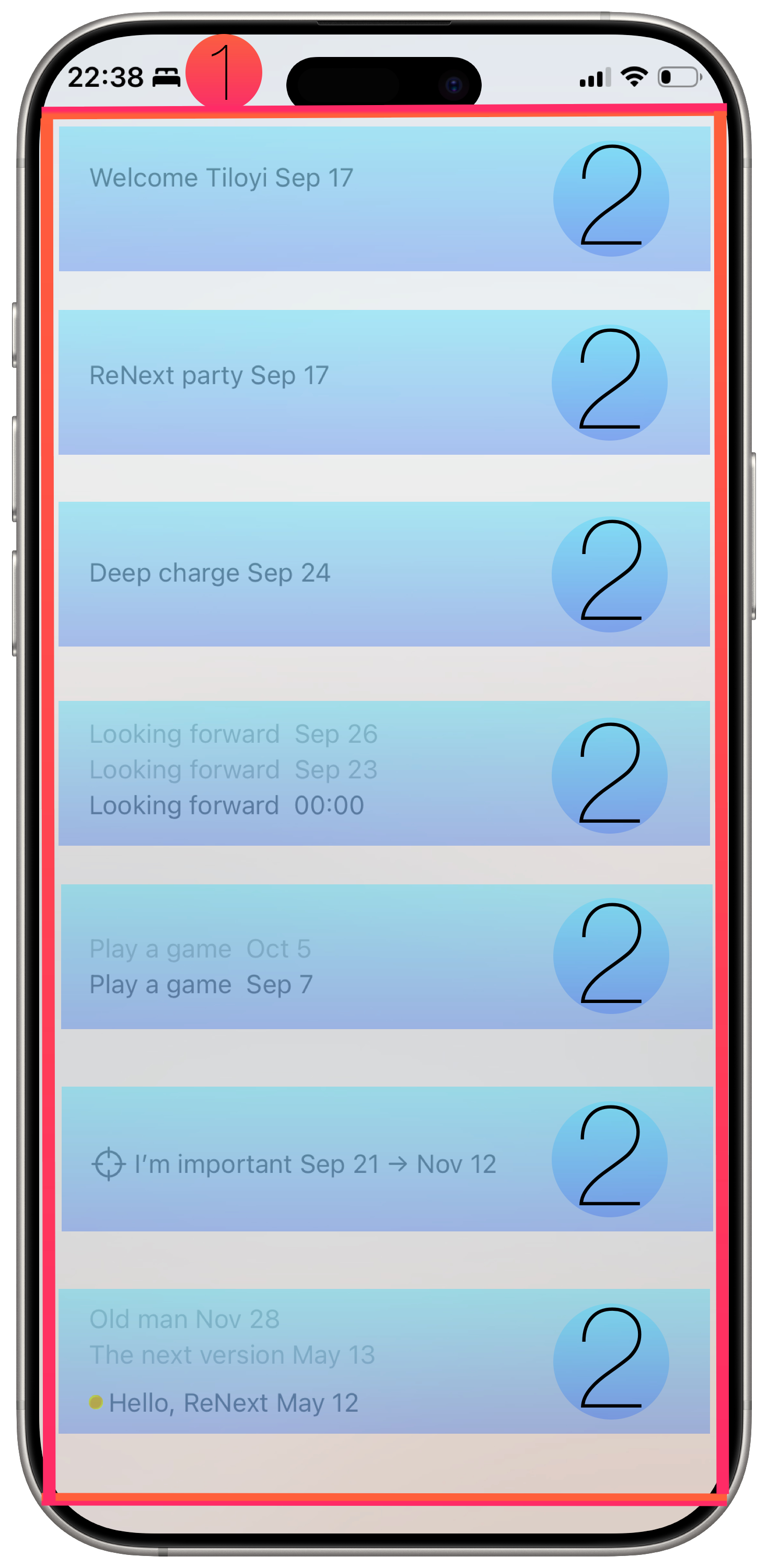
A: Basic description:
1. One page has at most eight completed to-do groups; completed to-do groups are arranged from bottom to up according to the time of the last completed to-do of the completed to-do group, from late to early.
2. Each completed to-do group has a fixed space on the Completed to-do group page.
3. Each completed to-do group shows at most 3 to-dos on the Completed to-do group page. Completed to-dos are arranged from bottom to up according to the time of the completed to-do, from early to late. It will be empty if there is no more completed to-do in the completed to-do group.
4. Click any completed to-do of a completed to-do group to enter the Completed details page to show all completed to-dos and to-do data of this completed to-do group.
5. The earliest completed to-do of each completed to-do group will have an inner shadow effect and a yellow cycle in front to give you a tip that it's the start of this completed to-do group.
Interact on the Completed to-do group page:
1. Long press and follow the natural sliding path of the thumb to drag ↗️ or ↖️ to scroll to the top of the page;
2. Long press and follow the natural sliding path of the thumb to drag ↗️ or ↖️ to scroll to the bottom of the page.
3. Slide right to go back to the Home page.
Q: What can I do on the Completed details page?
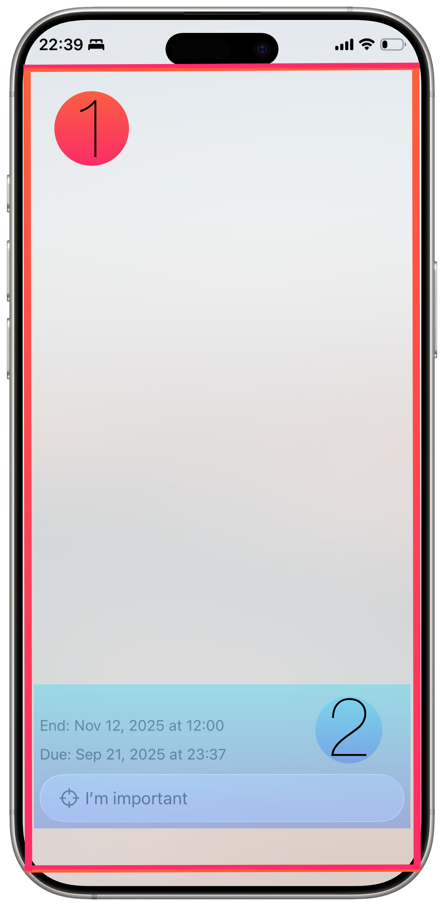
A: Basic description:
1. Completed to-dos are arranged from bottom to up according to the time of the completed to-do of the completed to-do group, from early to late.
2. Each completed to-do will display its data of To-do Name, Tag, Time, Location, Repeat, Linked App/Person. It will be empty if there is no data.
3. The to-do name will show in a blue bar to give you a tip that it's the start of a to-do.
Interact on the Completed to-do group page:
1. Long press and follow the natural sliding path of the thumb to drag ↗️ or ↖️ to scroll to the top of the page;
2. Long press and follow the natural sliding path of the thumb to drag ↗️ or ↖️ to scroll to the bottom of the page.
3. Slide right to go back to the Completed to-do group page.
Q: What can I do on the Add & Edit page?
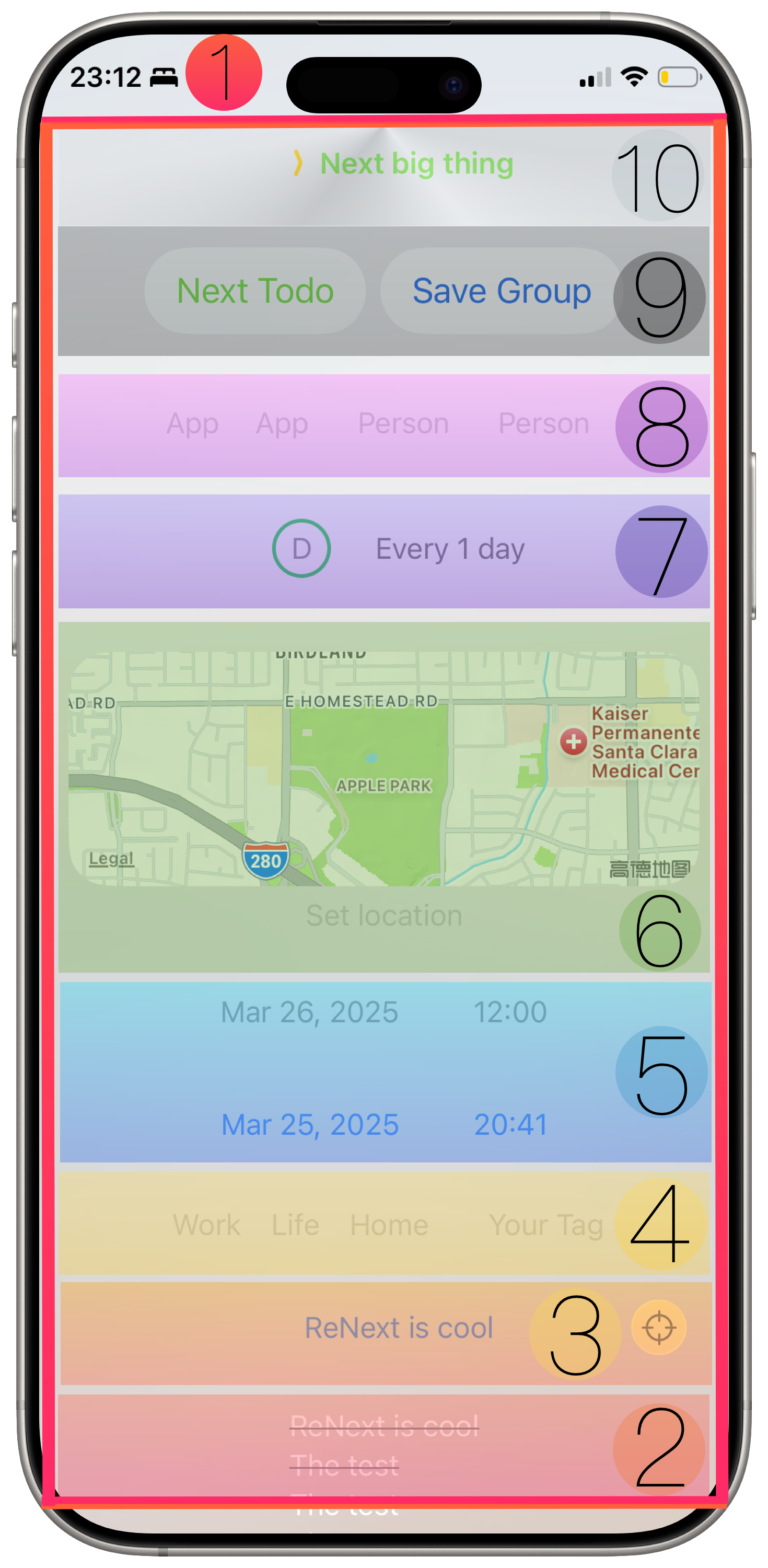
A: From bottom to up:
1. Section 2: the completed to-dos of this to-do group will show here and are sorted by time; the earlier, the lower. If there are not any completed to-dos of this to-do group, then it will be empty here.
2. Section 3: click To-do Name to input your to-do name. It must be set and it’s without doubt.
3. Section 4: click to choose one of the common tags from Work, Life, and Home, or you can click Your Tag to input your personal tag. It's optional to be set.
4. Section 5: click Due Date to pick the date when your to-do will start. Click Due Time to pick the precise time when your to-do will start. It must be set, because the sorting of to-do and to-do groups depends on it. End Dtae and End Time are optional to be set. If you only set an End Date, then the default End Time will be set as 12:00. If you only set an End Time, then the default End Date is the current day.
5. Section 6: click Set location to input the location where your to-do will be completed. The upper map will show the location that you input in real-time. It's optional to be set.
6. Section 7: set a fixed time to repeat your to-do: H standing for hour, D standing for day, W standing for week, M standing for month. It's optional to be set.
7. Section 8: click App to pick which kind of app will help you complete your to-do. Click Person to pick someone on your contact will help you complete your to-do. Because we can’t read the apps installed on your iPhone according to Apple's rules, we can’t let you pick an app installed on your iPhone. This is a compromise. If the person has an avatar, then it will show the avatar, otherwise it will show his/her first name. You can pick 2 apps and 2 people at most. It's optional to be set.
8. Section 9: click the Next Todo to save current data to iCLoud, current to-do will show in Section 10, and create a new empty to-do for this to-do group. Click the Save Group to save all to-dos in this to-do group to iCloud. If you don’t click button Save Group and slide down on text to exit the Add & Edit page, your current to-do will not be saved to iCloud, but the to-do you click the Next Todo before still saved to iCloud.
9. Section 10: the uncompleted to-dos of this to-do group will show here and are sorted by time; the earlier, the lower. You can click the uncompleted to-do to re-edit it. If there aren’t any completed to-dos for this to-do group, then it will be empty here.
Interact on the Add & Edit page:
1. Long press and follow the natural sliding path of the thumb to drag ↗️ or ↖️ to delete current to-do.
2. Slide right to go back to the Home page.
Q: What can I do on the Settings page?
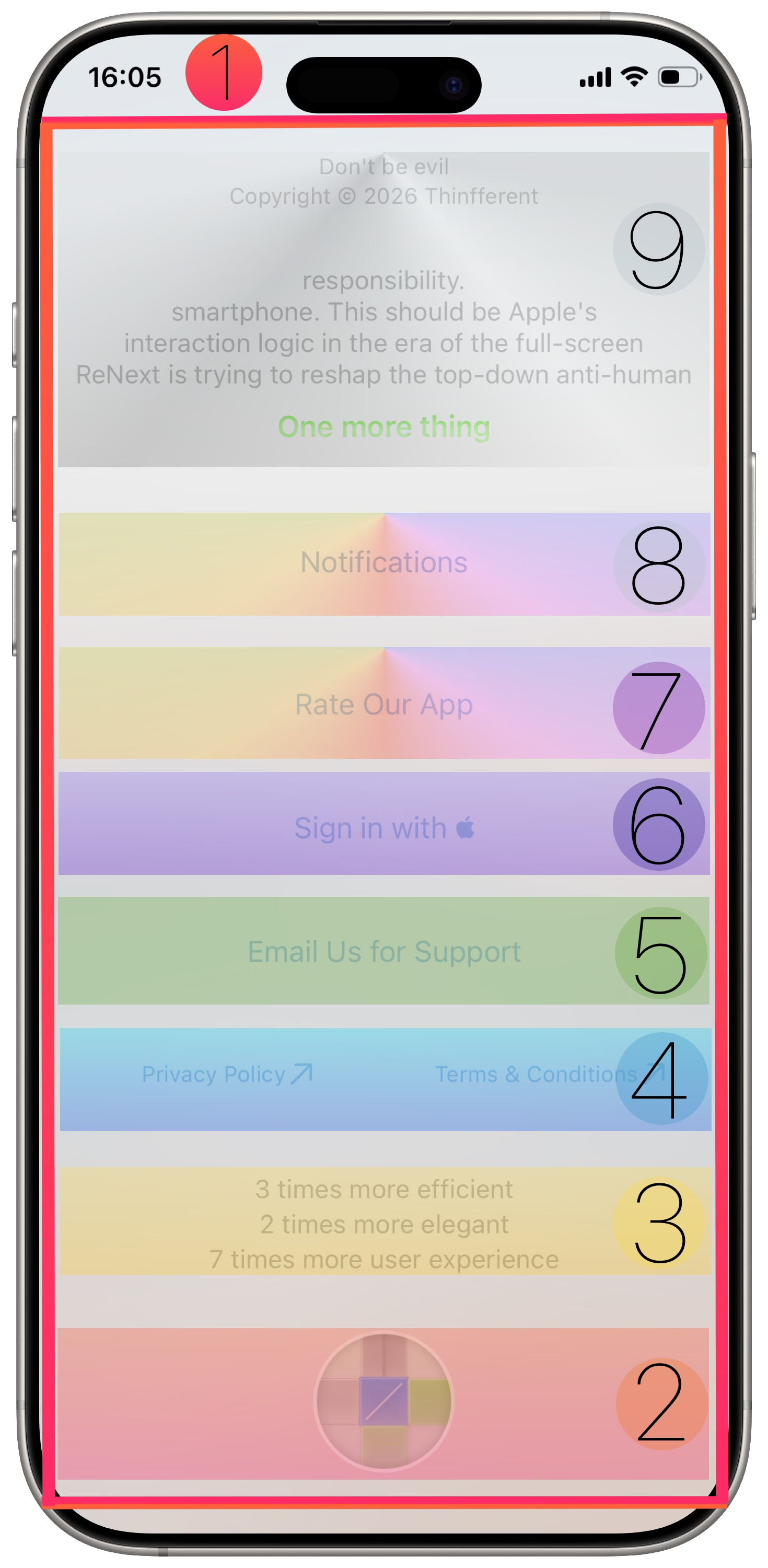
A: From bottom to up:
1. Section 2: click the ReNext logo to enter the page of tips for ReNext. Long press the ReNext logo to show your invitation code.
2. Section 3: just show the core values of ReNext.
3. Section 4: click the button to jump to the Privacy Policy or Terms and Conditions of ReNext.
4. Section 5: click Email Us for Support to contact us via our official email. It will default to open your Mail app and fill in our email.
5. Section 6: Click Sign in with to create or login into your account with Apple ID. Click again after logging in to enter the profile sheet.
6. Section 7: click Rate Our App to jump to the ReNext page on the App Store.
7. Section 8: click Notifications to jump to the iOS default Settings to turn on/off notifications. When the notification is turned off, there is a yellow circle in front of the Notifications. If the notification is turned on, the yellow circle will disappear in front of the Notifications.
8. Section 9: just show something that we think it’s needed.
Interact on the Settings page:
1. Slide right to go back to the Home page.
Q: What can I do on the Home page?
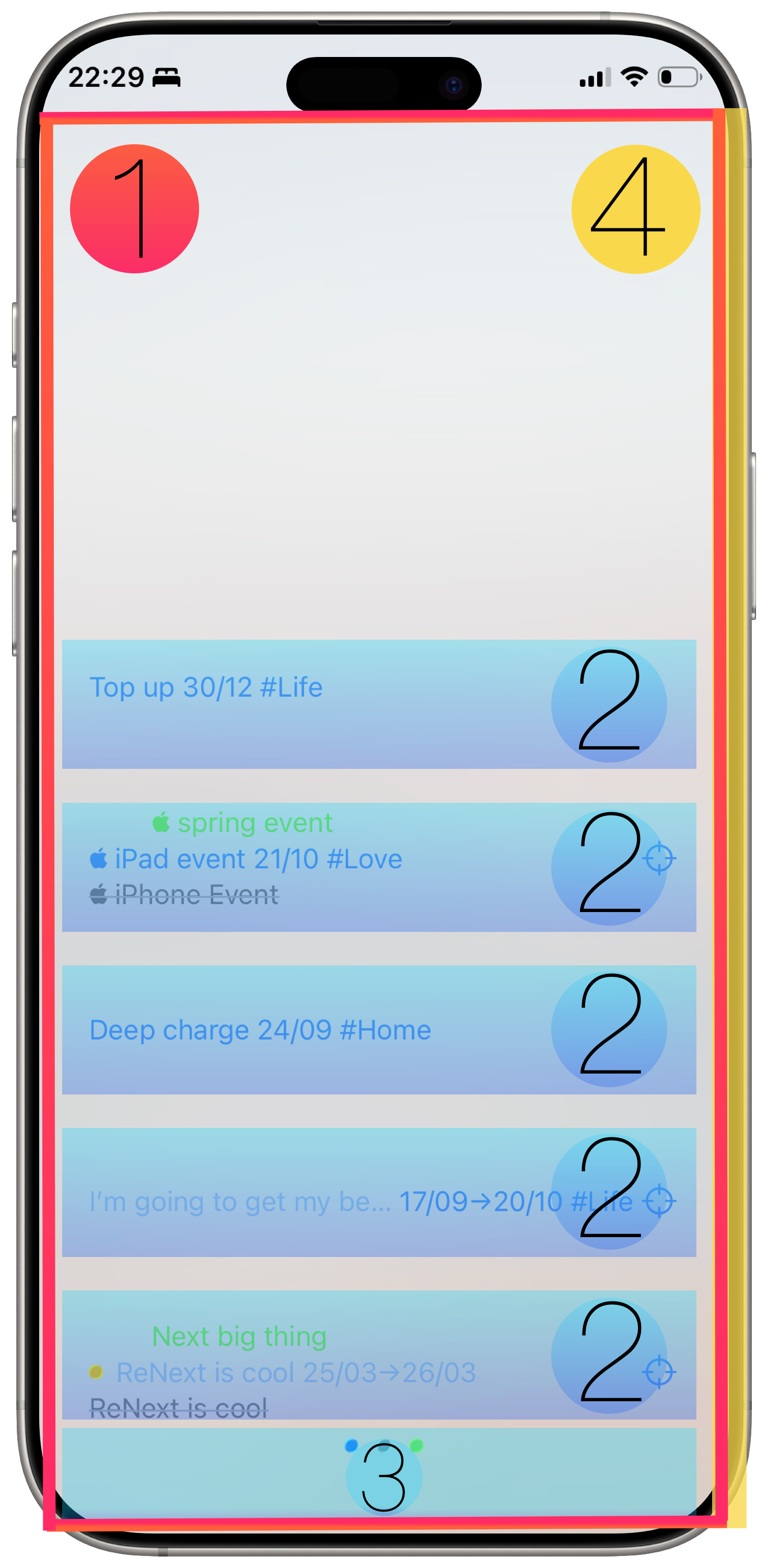
A: The Home page has two zones.
Next Interact Zone:
1. The zone under the 3-color-dot bar on the Home page.
2. Click the Next Interact Zone to enter the Add & Edit page.
3. Double-tap the Next Interact Zone to enter the Completed to-do group page if there is at least one completed to-do group in your iCloud.
4. Long press the Next Interact Zone to back to the bottom.
To-do Group Zone:
1. The zone above the 3-color-dot bar on the Home page.
2. One page has at most eight to-do groups, to-do groups arranged from bottom to up according to the time of the first uncompleted to-do of the to-do group from early to late.
3. Each to-do group has a fixed space in the To-do Group Zone.
4. Each to-do group shows at most 3 to-dos in the To-do Group Zone. The first uncompleted to-do of the to-do group is arranged in the middle. The second uncompleted to-do of the to-do group is arranged at the top, and it will be empty if there are less than 2 (not including 2) uncompleted to-dos in the to-do group. The last completed to-do of the to-do group is arranged at the bottom, and it will be empty if there is no completed to-do in the to-do group.
5. Only the middle to-do in the To-do Group Zone can be interacted with. Slide right to complete the blue middle to-do on the home page. Click the middle to-do to enter the Add & Edit page to edit the middle to-do.
6. When there are 24 hours before the middle to-do's time is up, if the middle to-do only has a Due Date & Due Time, it will enter countdown mode. Or when the middle to-do's Due Date & Due Time start, if the middle to-do also has an End Date & End Time, it will enter countdown mode. And if you didn’t complete the to-do after the countdown mode is over, then the to-do will always show a lighter blue.
7. The middle to-do will show the date if it's not the current day. And the middle to-do will show the time if it's the current day.
8. It will show an important image on the right if the middle to-do is marked as important.
Interact on the Home page:
1. Long press and follow the natural sliding path of the thumb to drag ↗️ or ↖️ to enter the Search page;
2. Slide left from the right screen to enter the Settings page.
Q: What are our users saying?
A:
User A:
While I have mixed feelings about the portmanteau "thinfferent" I do understand the homage and on some level can appreciate the motif behind the site's Jobs-esque styled product announcement.
Meanwhile, the actual name you've given for the app "ReNext" seems a lot more intuitive and informative combination of words. Seeing the screenshots alone might give me pause as the bold design choices (or almost a total lack thereof. Keyword being "almost" as it's not actually a "total" lack of UI design -- because I do see what you're doing with color, how you're playing with space, the overall bottom-up orientation that's friendly to finger-focused gesture-driven navigation, etc) seem to go well past the "minimalist" descriptor and sit squarely in the "spartan" range of UI's... but like I said, that was just my initial impression based solely on the screenshots. But the "ReNext" name finally tied it together for me and the idea behind the app actually clicked into place (yes, even more than the thinfferent landing page or the App Store description, all of which seemed a bit too contrived at first glance. What can I say? Sometimes it's the seemingly simple choices that make the strongest impressions, moreso than a Jobs'ian tribute ¯\_(ツ)_/¯ )
As I'd be more than happy and willing to try out this somewhat risky, highly experimental, gesture-driven, text-based, to-do/PM/GTD app you've clearly put a lot of thought into creating (even if the choices you've made seem almost sparse, they're certainly there... heh, I'm even noticing the choices you made in designing the app's icon right now as I pen this. It almost seems like an inconsequential doodle with no real thought put behind it. Almost. That's how deceptively simple it looks. But I'm guessing that the placement and colors of the quadrants hold some significance behind it, am I right?).
User B:
Loved that you're carrying on David Allen's legacy! As someone who's struggled to master GTD, I'm impressed by your dedication to making it accessible - one-handed typing, here we come!.
Q: Questions not listed here.
A: Email us at hello@thinfferent.com.
Q: More about our team?
A: I'm Shakenal, a Chinese and an independent founder. Nearly nobody. The greatest achievement was writing and publishing three semi-profesional books on Amazon. If you are interested, click the link to find out more about it.
Visit my Amazon Author Page